
The sales dashboard: pipeline, pace, and the leaderboard
Open Sales and you land on one of two dashboards, depending on your role. Account Executives get Your Day, everything scoped to their own book. Sales managers and tenant admins get Your Day too, and can switch to Team Cockpit for the whole team's numbers at once. Either way the page is a grid of tiles, each answering one question with one number, and the row of controls at the top (the view switch, the period, and New) stays in the same place whichever view you are in. If you manage a sales team (set up in Users & roles → Teams), the cockpit ranks just your team's reps by default, and a My team / Everyone switch in the Leaderboard header brings the full roster back.
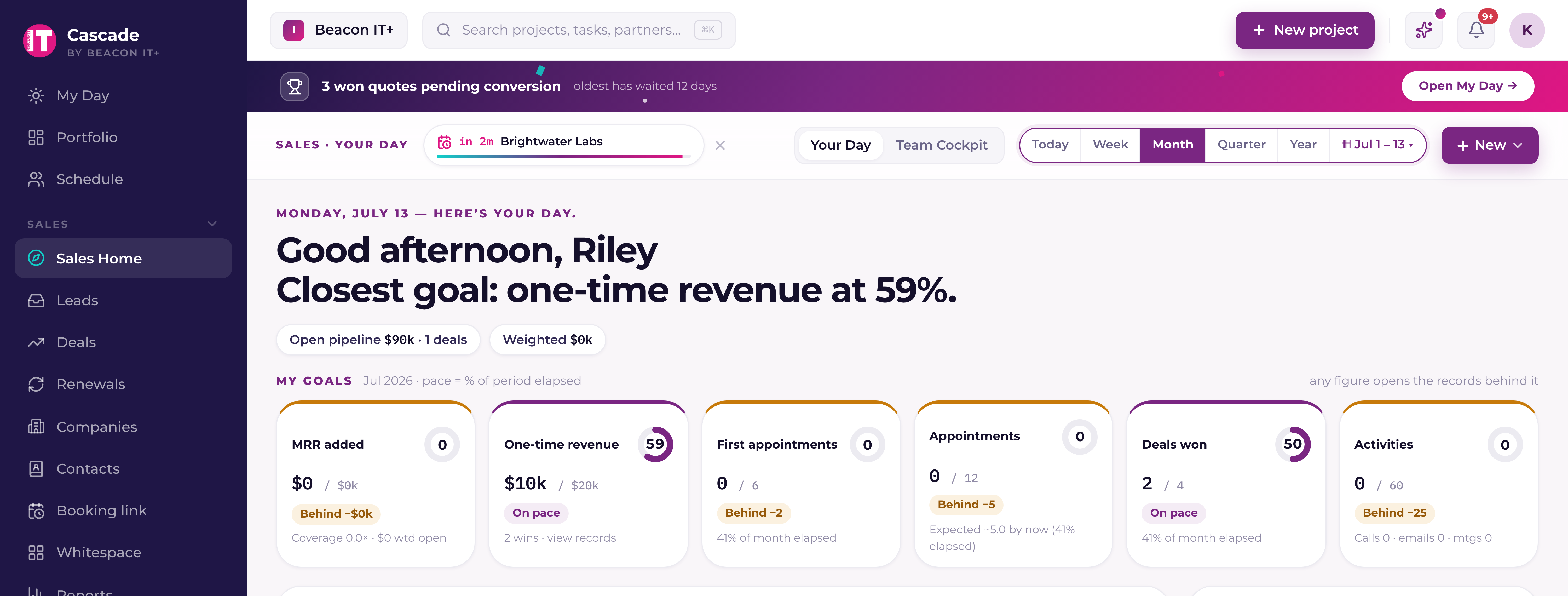
Your Day (every AE's home view)
The headline says what percentage of goal you are at, and My goals across the top breaks that into seven cards: MRR added, one-time revenue, first appointments, appointments held, deals won, activities logged, and business reviews presented. Each card carries a bar with a black tick on it. The bar is how much of the target you have done; the tick is where you should be today. A bar short of its tick is behind, and the card says by how much. A card with no target set says so and offers the way to fix it, rather than showing you a red bar for a goal nobody set.
Under that: your morning brief, with a check on each line to clear it for the rest of today; My book, which is your open pipeline, its probability-weighted forecast, and the deals nobody has touched in two weeks or more; a Headcount tile for the seats across your accounts; First appointments, the meetings you held with companies that never had one before; Motions, which races your won business against your own targets; Relationship health, the four accounts on your book closest to churning; your to-dos with a quick-add; the AI coach; and the goal race. Every number that has records behind it opens them in a panel when you click it.
Headcount trend: seat movement, measured from real history
The Headcount tile compares the billable seats across your book at two points in time, using the daily seat snapshots Current takes from your PSA. That comparison needs a reading at both ends of the period, and snapshots only exist from the day your workspace started taking them.
So the tile measures from the first day of seat history it actually has, and tells you which day that is. Pick a period that reaches back further than your snapshots go and the caption reads "since Jul 8" (or whatever your first day is) instead of the period name. With under a week of history it shows "Not enough seat history yet" and no seat numbers at all, rather than a movement figure that is really a total. If the history check itself fails, it says that instead, because "not enough history" would be a claim about your workspace that nobody verified. The line under the sparkline names the companies that moved, and clicking one opens its seat trend and open deals.
Team Cockpit (sales managers and tenant admins)
The top row is the money: open pipeline across every rep, the probability-weighted forecast, and what closed won in the period, split in its caption into recurring MRR and one-time. Beside them, a ring showing the team's pace and the names of whoever is behind it. Open pipeline and Weighted forecast describe the standing book, so moving the period control does not change them; only the Won tile carries a period.
Then the team brief, the day's opportunities and the accounts needing attention, next to three counts you can act on: at-risk accounts, deals idle 14 days or more, and renewals landing in the next 30 days. Each opens the list behind it. Below those sit the leaderboard; Won / lost, which splits the period's wins and losses across growth, expansion, renewal and projects so you can see which motion carried it; Motions, racing the team's won business against the team targets; Relationship health across every rep's book; the AI coach; your own to-dos, because leaders carry a book too; and the goal race.
Team targets are set on their own page, Sales then Goals, which sales leadership sees in the menu. Set targets in the Motions tile header takes you straight there, and so does Set a target on My goals.
Relationship Health: the accounts you're closest to losing
Both dashboards carry a Relationship health tile. It ranks partners, never prospects and never the unowned pool, by churn risk: the five riskiest on the Team Cockpit, the four riskiest on Your Day. Each row shows the account, the single biggest reason it is there, and its score, coloured by band. The ranking is computed live from your own data every time the tile loads; nothing is guessed.
| Signal | What it means |
|---|---|
| Survey churn risk | The company is flagged at risk from its survey results, or has logged negative survey responses in the last 90 days. |
| The AI's read | Current's written insight for the account says at risk or worth watching. This is where ticket patterns, seat growth or shrink, and overall sentiment are weighed. |
| Gone quiet | Partner Pulse has detected a sharp drop from the account's normal level of activity. |
| No human touch | Nobody has logged contact with the account in over 30, 60, or 90 days — the longer the silence, the heavier it counts. |
| Renewal at risk | An open renewal deal closing within 30 days is carrying a weak Renewal Defense Score. |
| Contract due | A PSA contract or agreement for the account ends within 60 days. |
| Stalled deal | A deal is sitting two weeks or more past its projected close date with no activity on it. |
Bigger partners weigh more, so a large account showing early warning signs can rank above a small one already in trouble. The row names the single biggest driver behind its score, in the account's own numbers (“no contact in 62 days”, “4 negative surveys in 90 days”); on the Team Cockpit the owning rep is named first. The AI never decides which accounts show up here or in what order, it only explains one the hard numbers already flagged. Click the account name to open a panel with its seat trend and open deals, and a link through to the company record. Amounts there show only for people who can see money figures.
Turning a risky account into a follow-up
- 1Hover the row and click Follow upThe action is quiet until you want it: it appears when you hover the row or tab to it, and stays visible on a touch device. The to-do is then written for you, titled with the company and its top risk reason, with the reasons themselves in the notes. Change anything you like, set the due date and reminder, and pick who it's for. A manager working the team board gets the rep who owns the account selected already.
- 2Confirm — you have five seconds to undoNothing is created until that window passes. That delay is deliberate: a to-do that has already reached Microsoft To Do can be completed, but it can never be un-sent, so the only safe undo is to not create it yet.
- 3Three things happen at onceThe to-do lands in your Current to-dos; it syncs to the “Current” list in your Microsoft To Do alongside everything else you're working; and a note is written to the company's internal timeline so the next person to open the account can see it was worked. Partner Viewers never see that note.
On Team Cockpit the same tile covers every rep's book, with the owning rep named on each row. There it does not hide accounts that have been actioned — one with a follow-up booked stays on the board carrying a “Follow-up scheduled” badge, so a manager sees the whole picture, including what is already being handled.
The leaderboard
Team Cockpit's leaderboard gives every rep one row and six columns: Pace to goal, a bar with the same black tick as everywhere else on the page, so you can see who is ahead of today and who is behind it without reading a number; Goals on track, seven dots, one per goal, each coloured by how that goal is doing, with a count beside them; then Pipeline, Won, Win rate, and At risk.
Click a column heading to sort by it. Pace sorts whoever is furthest behind to the top, because that is who needs you; every other column puts the top performer first. Click the heading again to reverse it. A rep whose number cannot be known, no goal set, nothing closed yet, no win rate, always sorts to the bottom, whichever way round the column is.
Click a row to open it. The seven dots become seven cards in the same order, each with the actual, the target, its own bar and tick, and, for anything behind, the exact amount it is behind by. Click a card to see every record behind that number. Above the cards, one line names the goals the rep is behind on.
If you manage a sales team, a My team / Everyone switch sits in the Leaderboard header. My team narrows the leaderboard, the team pace ring, Motions, the AI coach and the goal race to your own reps; the money tiles, the brief, Won / lost and Relationship health always cover everyone, and the line under the header says so.
How pace is scored
Each goal is scored on its own: the actual divided by the target. At 100% it is Met. Below that, the score is read against how much of the period has gone by, which is where the tick on every bar comes from: under 90% of where the elapsed time says it should be is Behind, above 110% is Ahead, and anything between the two is On pace. A goal with no target set is not scored at all, so it is never counted as a miss. A rep's pace is the average of the goals they do have, with each one capped at 130% first so a single outsized win cannot carry a month it did not carry, and the team's pace is the average of the reps' paces. The percentage in the headline and the one in the team pace ring are the same number.
Date lenses
Every number on the dashboard reads from one shared period control in the bar at the top: Today, Week, Month, Quarter, Year, or a custom range. Month is the default, and the choice is remembered for you. The calendar button beside the presets is where a custom range is picked, and it also carries the compare-vs-prior toggle; while a custom range is active the button spells the range out and none of the five presets is selected.
Goals are the one thing that does not follow it exactly. Targets are set per calendar month, quarter or year, so Today and Week read against the current month's goals rather than a target for a single day. The caption on every goal tile names the period it is scoring, so the two are never confused.
Reports
The Sales category in Reports is the deeper cut of the same data, on a date range you set once for the whole page: Pipeline & forecast, Forecast accuracy, Deals by type, MRR movement, your scorecard, Whitespace coverage and Book & activity. Use it when a dashboard tile needs a closer look rather than a glance, and Schedules there to have any of them emailed to you weekly or monthly as a PDF.